Implementing a boolean user setting and toggle user interface
For those interested in the technical side of DoMath.io, a side project I've been working on to help kids build math fluency, I wanted to share more detail on how I implemented a feature that allows users to enable and disable sound effects in the game.
Technical detail
To model settings for a user, I have a user settings database table. One attribute is called sound_enabled and stores a boolean value that is default true for all users.
To allow the user to toggle their sound_enabled setting on or off, I needed to create a toggle switch. I used Stimulus and ViewComponents to do so.
# app/components/toggle_component.rb

class ToggleComponent < ViewComponent::Base
  def initialize(form:, field:, default_value:, label:, description: nil)
    @label = label
    @description = description
    @form = form
    @field = field
    @default_value = default_value
  end
end
<!-- app/components/toggle_component.html.erb -->
<div data-controller="toggle">
<%= @form.hidden_field @field, value: @default_value, data: { toggle_target: "hiddenField" } %>
<div class="flex items-center justify-between">
<span class="flex flex-grow flex-col">
<span class="text-sm font-medium leading-6 text-gray-900" id="availability-label">
<%= @label %>
</span>
<% if @description %>
<span class="text-sm text-gray-500" id="availability-description">
<%= @description %>
</span>
<% end %>
</span>
<button data-action="toggle#toggleInput" data-toggle-target="outerSwitch" type="button" class="bg-cyan-600 relative inline-flex h-6 w-11 flex-shrink-0 cursor-pointer rounded-full border-2 border-transparent transition-colors duration-200 ease-in-out focus:outline-none focus:ring-2 focus:ring-cyan-600 focus:ring-offset-2" role="switch" aria-checked="false" aria-labelledby="availability-label" aria-describedby="availability-description">
<span aria-hidden="true" data-toggle-target="innerSwitch" class="translate-x-5 pointer-events-none inline-block h-5 w-5 transform rounded-full bg-white shadow ring-0 transition duration-200 ease-in-out"></span>
</button>
</div>
</div>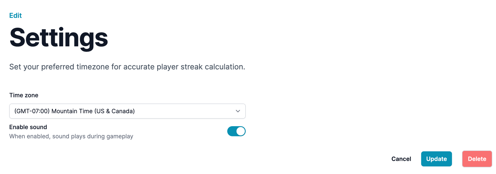
The ViewComponent is initialized with a label, description, form, field, and default_value. The label is the main text the user sees next to the toggle switch. In the screenshot above it is the bold text to the left of the toggle, "Enable sound." The description is more detail for the user. In this case the description is, "When enabled, sound plays during gameplay." The form is the parent form object to which this toggle belongs.
Under the hood, the ViewComponent creates a hidden form field to store the value of the toggle. I'm not sure if using a hidden field for a toggle value is standard practice, but I found it to be a nice solution.
The field is the name of the hidden field, which is important for finding the data submitted by the user in the controller. The default_value is whether the toggle should initially be on or off.
To animate the toggle I use a combination of TailwindCSS classes and a Stimulus controller to hold the JavaScript necessary to swap the necessary classes. The Stimulus controller also handles an on click function that will store the appropriate value in the hidden field when the user clicks the toggle.
import { Controller } from "@hotwired/stimulus"

// Connects to data-controller="toggle"
export default class extends Controller {
  // Stimulus allows us to define "targets" for a given controller in our
  // html data attributes. In this case we have the hidden field which will
  // store the on / off value, and the inner and outer parts of the toggle.
  // Both of these elements have specific styles applied to make them look
  // like the toggling of a switch when the user clicks on them.
  static targets = ["hiddenField", "innerSwitch", "outerSwitch"]

  // upon page load, match the style of the toggle switch to the
  // default value
  connect() {
    if(this.hiddenFieldTarget.value === "true") {
      this.toggleOn();
    } else {
      this.toggleOff();
    }
  }

  // apply the styles to show the toggle switch in "on" mode
  toggleOn() {
    this.outerSwitchTarget.classList.remove("bg-gray-200")
    this.innerSwitchTarget.classList.remove("translate-x-0")
    this.outerSwitchTarget.classList.add("bg-cyan-600")
    this.innerSwitchTarget.classList.add("translate-x-5")
  }

  // apply the styles to show the toggle switch in "off" mode
  toggleOff() {
    this.outerSwitchTarget.classList.remove("bg-cyan-600")
    this.innerSwitchTarget.classList.remove("translate-x-5")
    this.outerSwitchTarget.classList.add("bg-gray-200")
    this.innerSwitchTarget.classList.add("translate-x-0")
  }

  // toggle the value of the hidden field from true to false or
  // false to true
  toggleInput() {
    if(this.hiddenFieldTarget.value === "true") {
      this.toggleOff();
      this.hiddenFieldTarget.value = "false"
    } else {
      this.toggleOn();
      this.hiddenFieldTarget.value = "true"
    }
  }
}
What I like most about this solution is that the toggle is not at all specific to the sound feature. It's a generic toggle that I can re-use anywhere in DoMath.io by calling render in a view and supplying appropriate parameters.
<%= render(ToggleComponent.new(form: form, field: :sound_enabled, default_value: @user_setting.sound_enabled, label: "Enable sound", description: "When enabled, sound plays during gameplay")) %>Finally, to tie it all together, when a player is served a new problem, we check the user's settings. At that point we disable the sound if the user opts out of the delightful chime. To each their own!
Have you implemented something similar in your own projects? I'd love to hear about it in the comments below or you can reach out directly.